
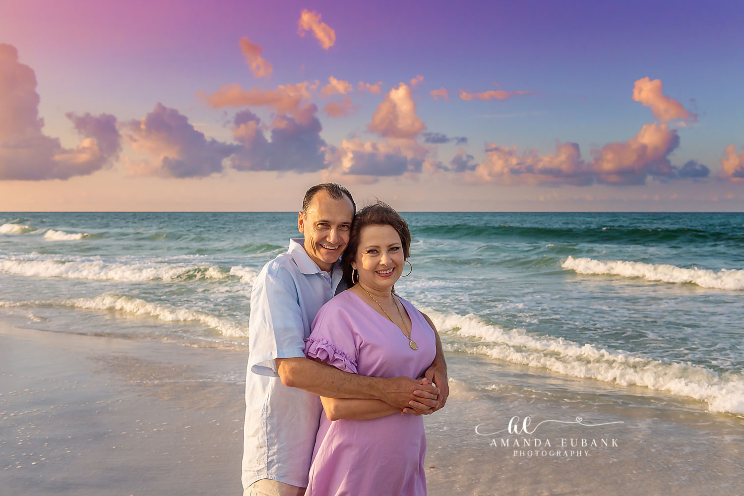
What colors do Santa Rosa Beach family photographers recommend for portraits? Soft blues, sage green, blush, cream, tan and muted coral lead the list. These shades complement the shoreline, flatter most skin tones and blend well across a group of any size. Color is the first thing people notice in a family portrait, so it deserves more thought than any other wardrobe decision. Here is the guidance I give as a Santa Rosa Beach family photographer.
Palettes Santa Rosa Beach Family Photographers Rely On
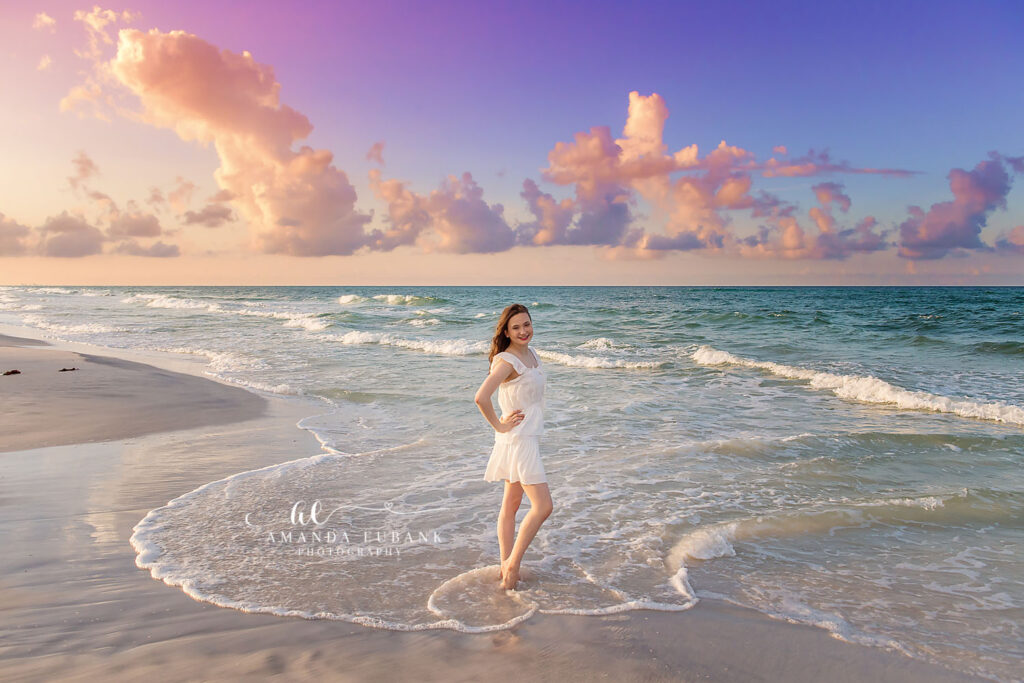
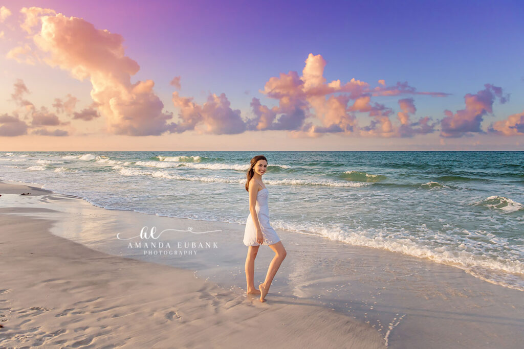
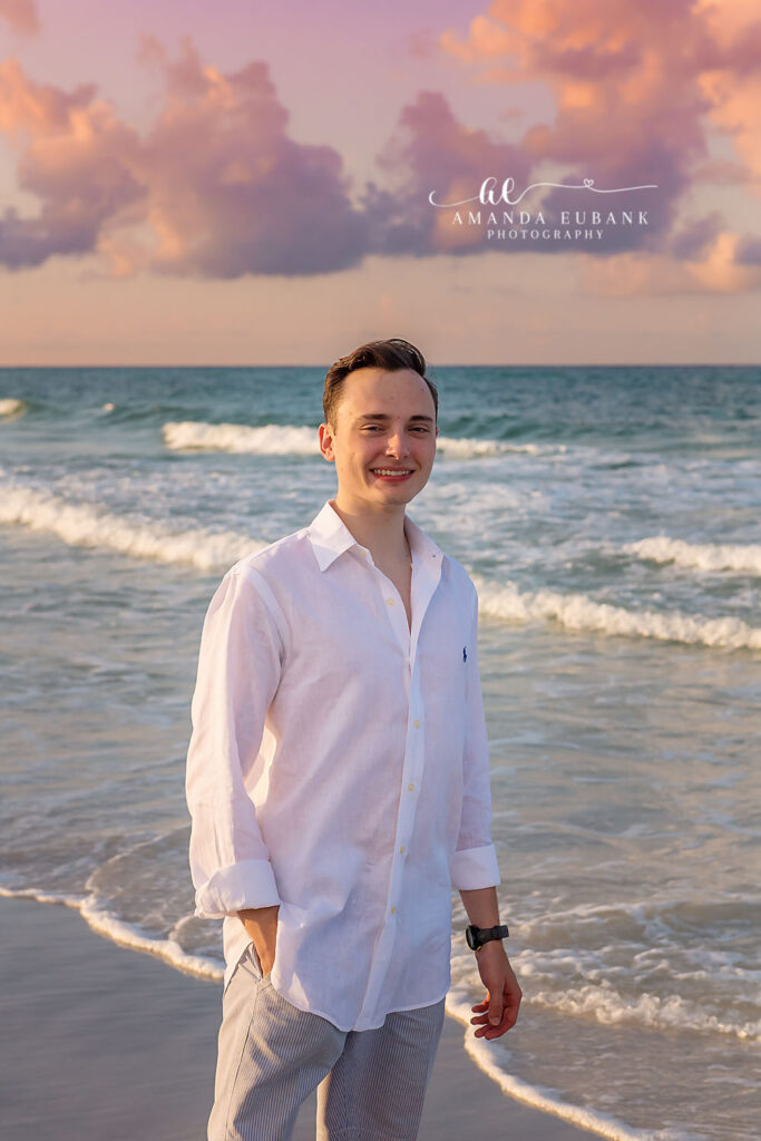
Light blue, white, tan and a touch of navy have been popular for years because they echo the sky, sand and water. The combination is safe, bright and timeless. To keep it from feeling plain, vary the textures with linen, eyelet, chambray and knit.
Blush, peach, terracotta, mustard and cream glow in evening light. They pick up the pink and orange in the sky and feel cozy in cooler months. Add one neutral, such as oatmeal or soft gray, so the group does not look too sugary.
Sage, olive, dusty teal and slate pair nicely with sea oats and dune grass. Earth tones photograph especially well in fall and winter. A cream or ivory piece somewhere in the group keeps the set from going dark.
How Many Colors to Use and Where to Put Them
Three is easy to manage, and four gives more variety for larger groups. Pick one main color, one supporting color and one or two neutrals. Spread them around so no two people standing together wear the exact same shade.
Put the strongest color on one or two people and let it repeat in small ways elsewhere, like a hair bow, a stripe or a pocket square. Parents in mid-tones and children in lighter tones usually balance well. Avoid dressing only one person in a dark color, because that person becomes a visual hole in the frame.
Colors for Gardens, Towns and the Seasons
A second location changes things. Against green hedges and flower beds, white and pastels look crisp, while greens can disappear. Painted cottages already supply plenty of color, so simpler outfits read better there.
Spring sessions suit fresh pastels such as lavender, butter and mint. Summer welcomes brighter coral and aqua, kept in check with white and tan. Autumn is the time for rust, olive and mustard against golden sea oats. Winter evenings look beautiful with navy, cream, gray and a hint of burgundy. Matching the palette to the season makes the pictures feel anchored to the trip you actually took.
Problem Shades on Santa Rosa Beach Sand, Plus Common Questions
Neon tones reflect onto skin. Bright red in a large patch dominates everything near it. Black absorbs light and feels heavy on a beach. Head-to-toe white blends into the sand.
Can we wear denim? Yes, light and medium washes read as soft blue and go with nearly everything. Is black ever acceptable? A small amount is fine in winter, though navy does the same job more gently. Should the kids match each other? Related tones look better than twins-style sets, unless the children are very close in age and you love the effect.
Skin Tones, Home Decor and Large Groups
Hold fabric near each person’s face in daylight. The right shade brightens eyes and evens skin. Redheads often shine in greens and teals, and deeper skin tones carry mustard, coral and white beautifully.
Many families hang these portraits at home. Glance at the room where a print might live and choose tones that sit well with it. A gray and blue living room suits a cool palette, while warm wood and cream rooms welcome blush and tan.
Share a simple palette card with the whole group early. Ask each household to send a quick phone picture of their choices so overlaps can be fixed before travel. Families who book receive access to my beach style guide, which has palette examples ready to forward.
Want feedback on your colors? Use the contact form or call (850) 660-3200, and browse the 30A family photographer page for real combinations.
