

How do you coordinate colors without matching for a Santa Rosa Beach couples photographer? Choose a small palette of two or three colors and split them between you, so each outfit shares one shade with the other. That overlap ties the pair together while keeping two distinct looks. It takes about ten minutes once you know the method. I walk couples through it regularly as a Santa Rosa Beach couples photographer.
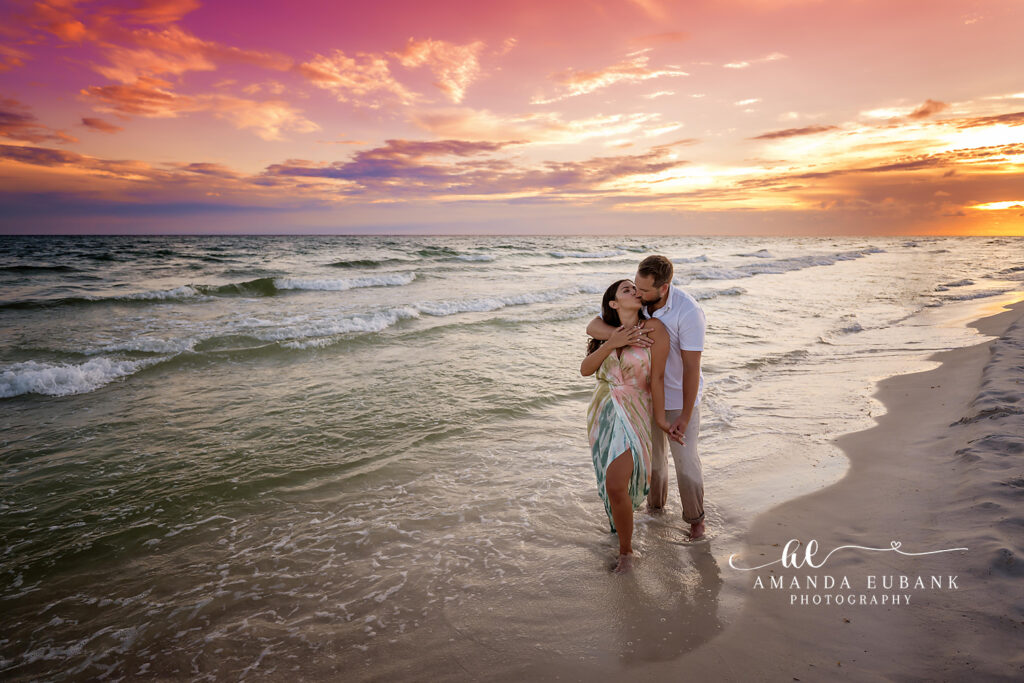
Three Steps a Santa Rosa Beach Couples Photographer Uses
Step one is to pick the lead piece. Start with the item that has the most personality, usually a patterned dress or a colored top. Everything else follows from it. If neither of you owns a standout piece, choose a favorite color instead.
Step two is to pull a supporting color. Look at the lead piece and find a secondary shade in it. A floral dress with blue, cream and green offers three options. His shirt takes one of them. Step three is to add a neutral. Tan, white, gray, cream or denim rounds out the palette. Neutrals calm the frame and let the main color stand out. Pants, shorts and layers are the easiest places for them.
Two Example Palettes
Here is one example. She wears a blue and cream print dress. He wears a cream linen shirt and tan chinos. Blue appears once, cream appears twice and tan grounds it. Nothing matches exactly, and everything belongs.
Here is another. He loves a sage green shirt. She chooses a white dress with a sage ribbon or sandals in a similar tone. A small echo is enough to connect two outfits. The same trick works in reverse, with his shirt picking up the color of her earrings or the trim on her dress. Small repeats like these look deliberate without looking planned.
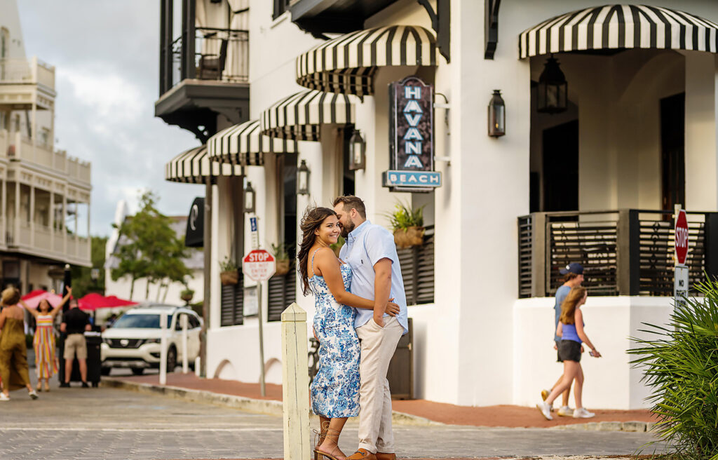
Tone, Brightness and Color Families
Colors should share a similar intensity. Pastel beside pastel looks soft, and rich beside rich looks bold. A neon top next to a muted dress feels unbalanced. Stay within one family when possible. Warm tones include coral, peach, rust, mustard and cream. Cool tones include blue, gray, lavender and crisp white. Mixing them can work with a neutral in between.
Avoid placing one person in very dark clothing and the other in very light. The contrast can make exposure harder and pulls focus to one side.
Texture, Patterns and Accessories as Connectors
When colors are close, vary the material. Linen with knit, eyelet with denim and gauze with cotton keep two similar shades from blending into one shape. One pattern is plenty. Keep the print on the person who enjoys attention, and let the other wear a solid drawn from it.
A scarf, hat band, belt or pair of earrings can carry the shared color. This is handy when one partner refuses to wear anything but white or navy.
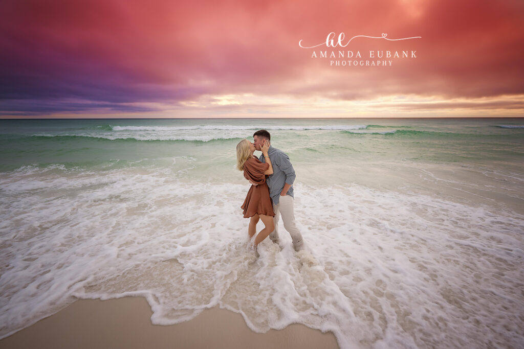
Colors That Suit Santa Rosa Beach
Pale sand and green water favor mid-tones. Dusty blue, sage, blush, coral and tan are dependable. Solid white on both people fades into the beach.
Change the palette for the second outfit. Cool tones first and warm tones second gives the gallery variety. The common slip-ups are buying matching shirts, choosing colors under store lighting only and forgetting to try both outfits together.
How a Santa Rosa Beach Couples Photographer Checks a Pairing
Lay both outfits on a bed in daylight and step back. Your eye should travel across both evenly. If one piece shouts, tone it down or move that color to an accessory. Couples who book receive access to my beach style guide, which shows sample palettes for two. Use it as a springboard.
Short on time? Use this shortcut. She picks any dress or top she loves. He wears white or cream on top and tan or gray below. Then add one item in her color to his outfit, such as a belt, a watch strap or a pocket square. That single echo is enough to make two outfits read as a pair, and it takes less than five minutes.
Send a picture of your pairing through the contact form or call (850) 660-3200. See color combinations in real sessions on the 30A photographer page.
