
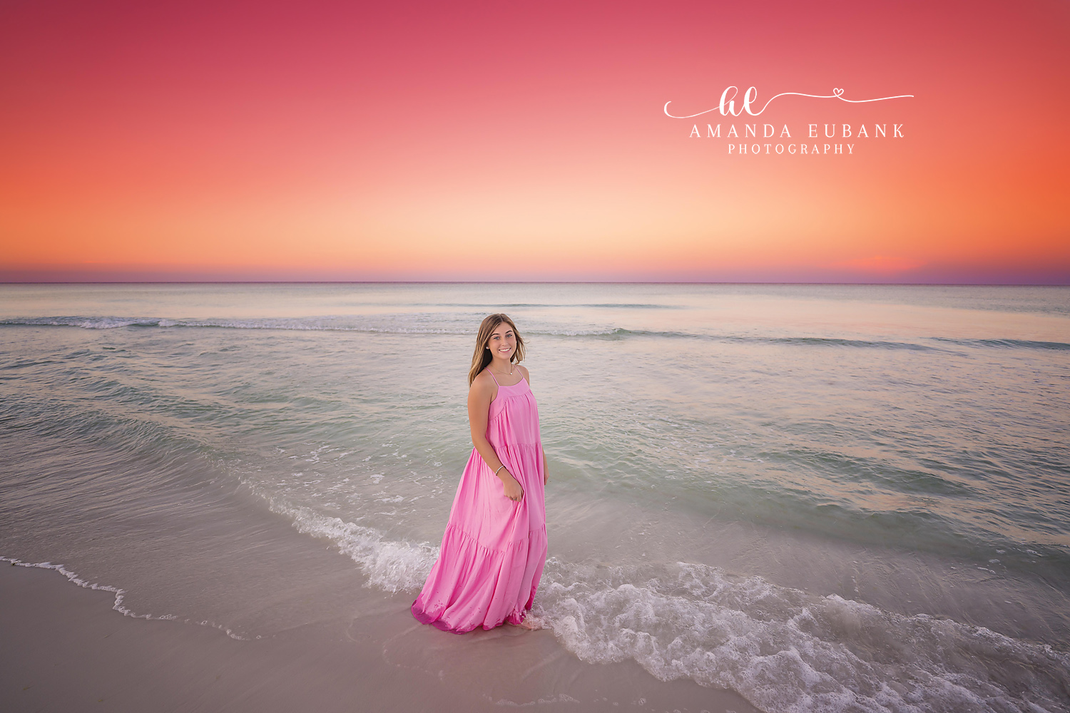
Which outfit colors does a Santa Rosa Beach senior photographer recommend for beach portraits? Mid-tone, saturated shades come first: coral, rose, cobalt, teal, sage and warm red. Those hues hold their own against pale sand and green water without overpowering your face. I have watched hundreds of color choices play out in front of my lens as a Santa Rosa Beach senior photographer, and the pattern is consistent enough that I can predict a gallery from the suitcase.
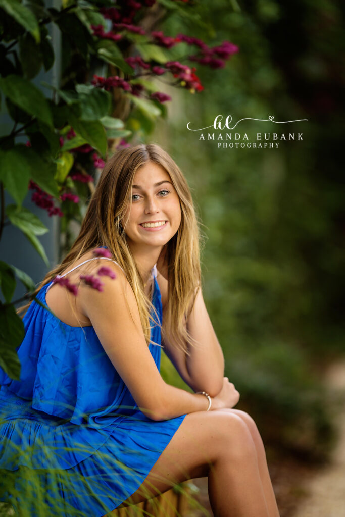
Why Color Matters More With a Santa Rosa Beach Senior Photographer
Most portrait locations have busy backgrounds that add their own color. This shoreline is different. The beach is close to white, the dunes are tan and green, and the Gulf sits somewhere between jade and aqua. That leaves a quiet, pastel stage, which means whatever you wear becomes the loudest thing in the picture. A strong dress color looks intentional here in a way it might not in a city park.
Colors That Flatter at Sunset in Santa Rosa Beach
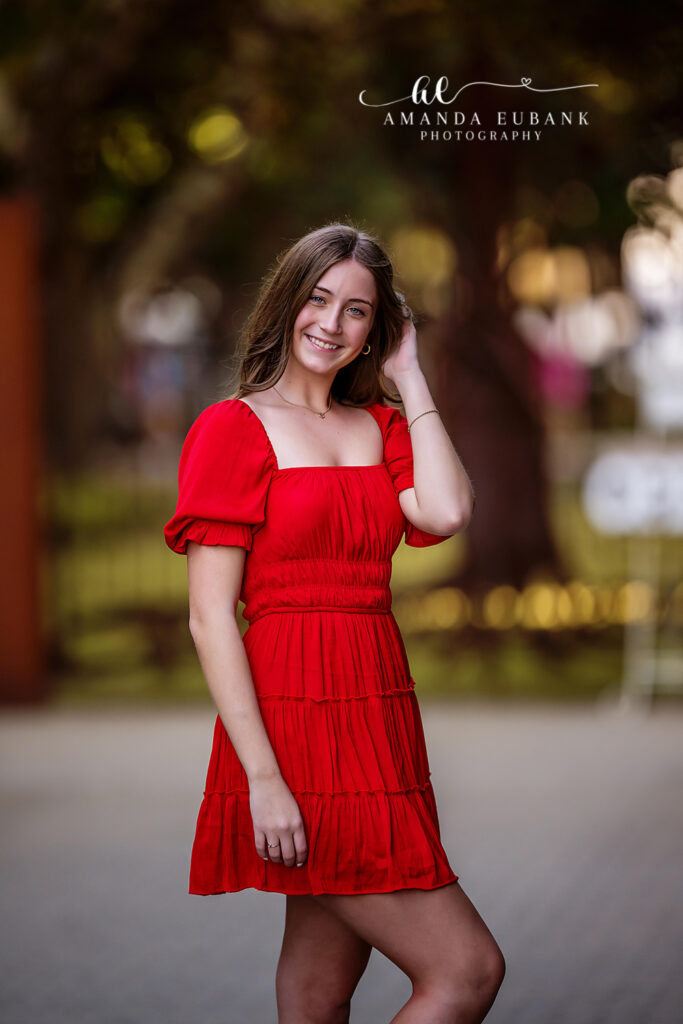
Evening sessions bring pink, apricot and violet into the sky. Pink and coral outfits echo those tones and create a soft, blended look. Blues and teals do the reverse and stand apart from the sky, which makes the subject jump forward. Warm red is the boldest option and reads beautifully once the sun drops low. Butter yellow can work on deeper skin tones and tends to wash out fair ones, so try it near a window before committing.
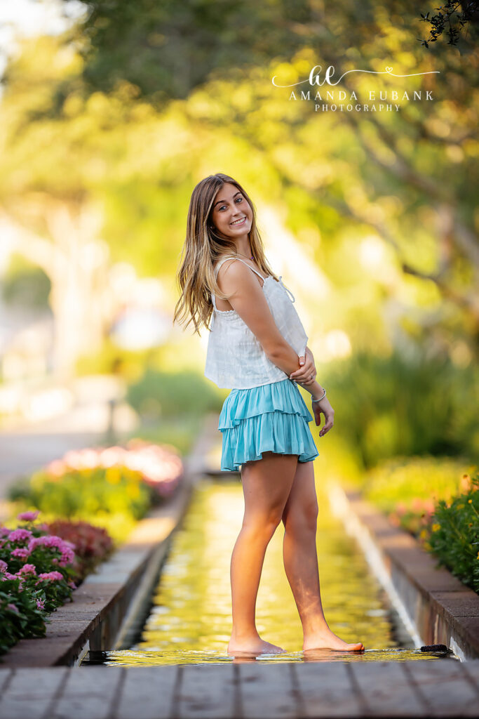
Colors for Gardens and Town Settings Near Santa Rosa Beach
Many seniors add a second stop away from the water. Green hedges, brick paths and flower beds change the math. Crisp white, which I discourage on sand, suddenly looks fresh against foliage. Jewel tones such as emerald can vanish into the leaves, so I point seniors toward blue, blush, lavender or a clean neutral with one bright accent. Painted cottages and shop fronts already carry plenty of color, and a simpler outfit keeps the frame from feeling crowded.
Shades for Guys Working With a Santa Rosa Beach Senior Photographer
Navy, slate blue, olive, heather gray and soft coral are reliable for shirts. Khaki, stone or light gray shorts and chinos pair with all of them. A light blue button-down against the water is a classic for good reason. Deep burgundy is a nice surprise in the cooler months. I would avoid bright white tees alone and anything with a large graphic across the chest.
Coordinating Outfits, Accessories and Layers
Pick looks that differ from each other. If the beach dress is pink, make the second outfit blue or neutral instead of another pink. Variety across outfits gives your gallery range for graduation announcements, wall prints and a yearbook submission. Keep jewelry in the same metal family so pieces can carry from one look to the next. Seniors who book receive access to my beach style guide, and it lays out sample palettes side by side.
A single accent can rescue a quiet outfit. Try a rust or mustard cardigan over a cream dress, a turquoise necklace with a plain tee or a patterned scarf tied to a bag. Hats bring shape as well as color, although wide brims catch wind on open sand. Shoes rarely show at the water, so spend your effort from the waist up. Nail polish counts as a color choice too, and a soft neutral shade avoids clashing across several outfits. Guys can add interest with a woven belt, a watch with a leather band or a rolled sleeve that shows a contrasting lining. Keep it to one accent per look. Too many extras compete with each other and with you.
Hold each piece under your chin in daylight and take a quick selfie. The right shade brightens your eyes, and the wrong one adds shadows or a sallow cast. Ask a blunt friend for a second opinion.
Send your shortlist when you reach out through the contact form, or call (850) 660-3200. You can also browse the WaterColor senior photographer page for examples of garden and beach color pairings.
